

Content: # A KPI Dashboard That Survives Contact With Reality
Every RevOps team eventually builds the "Ultimate Executive Dashboard"—a sprawling, multi-tab monstrosity containing dozens of charts, gauges, and tables tracking every conceivable metric. It looks impressive on the day it's launched. But within a month, the data is stale, the CRO stops checking it, and reps actively avoid it because the numbers never seem to match what's actually happening in the field.
The problem? most dashboards are built for reporting, not for operating. They display lagging indicators (like closed-won revenue) that are impossible to influence, or vanity metrics (like email open rates) that don't correlate with actual business health. When a dashboard fails to provide actionable insights, it quickly becomes irrelevant.
This article outlines how to build a KPI dashboard that actually survives contact with reality. We'll show you how to strip away the noise, focus on leading indicators, and design a dashboard that revenue leaders actually use to make decisions, diagnose problems, and drive performance.
What We'll Cover
In this article, we will cover:
- Why most executive dashboards become irrelevant within a month
- The difference between operational metrics and reporting metrics
- The 5 essential leading indicators every revenue dashboard must include
- How to design a dashboard for immediate actionability
- A framework for maintaining data hygiene and dashboard trust
Understanding the Approach
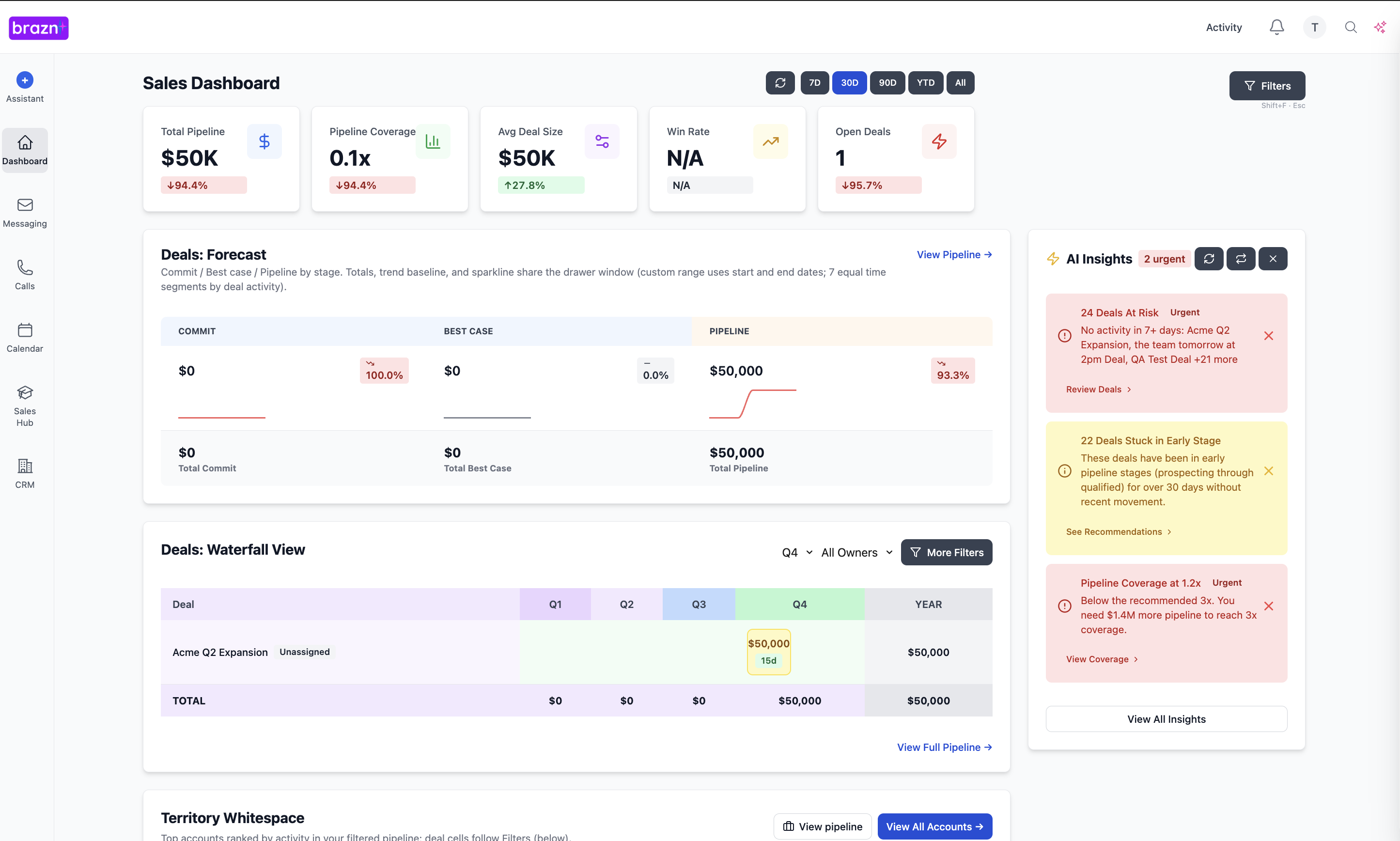
An "Operational KPI Dashboard" is a focused visual interface that tracks the specific, leading indicators that drive future revenue. Unlike a historical reporting dashboard, it's designed to highlight anomalies, risks, and trends in real-time, allowing leaders to intervene before a quarter is lost.
In RevOps, building a resilient dashboard means prioritizing data accuracy and relevance over visual complexity. For example, instead of just showing "Total Pipeline," an operational dashboard shows "Pipeline Coverage Ratio for Next Quarter," immediately alerting the CRO if there isn't enough early-stage opportunity to meet future targets, prompting a shift in marketing spend.
Why This Matters
A reliable, operational dashboard is the steering wheel for your revenue engine. Without it, you're driving blind.
- Before: Leadership relies on end-of-month reports, making it impossible to course-correct if the team is tracking behind target. After: Leadership has real-time visibility into leading indicators, allowing for proactive adjustments to strategy and resource allocation weeks before the quarter ends.
- Before: Meetings are dominated by arguments over whose data is correct, wasting valuable strategic time. After: The dashboard serves as the single source of truth, aligning all GTM teams around a unified set of verified metrics.
- Before: Managers struggle to identify which reps need coaching until they miss their quota. After: The dashboard highlights specific behavioral bottlenecks (e.g., low conversion from Discovery to Demo), allowing managers to provide targeted, timely coaching.
The Complete Guide
1. The "Less is More" Audit
Objective: Strip away vanity metrics and focus on what actually matters.
Actionable Advice: Review your current dashboard and ask one question for every chart: "If this metric goes down by 20% tomorrow, what specific action will we take?" If the answer is "nothing" or "I don't know," remove the chart.
Best Practices: Limit the executive dashboard to no more than 6-8 core KPIs. If leaders need more detail, they can click into a specific report.
2. Prioritize Leading Indicators
Objective: Track the metrics that predict future success, not just past performance.
Actionable Advice: Shift focus away from lagging indicators (like ARR or Churn) and highlight leading indicators. Key examples include: Pipeline Generation Velocity (new pipeline added this week), Stage Conversion Rates, and Sales Cycle Length.
Best Practices: Ensure leading indicators are tracked against specific targets or historical benchmarks to provide context.
3. The "Action-Oriented" Design
Objective: Design the dashboard so anomalies and risks are immediately obvious.
Actionable Advice: Use color coding strategically (e.g., red for off-track, green for on-track) but sparingly. Instead of just showing a number, show the variance against the target. For example, instead of "15 Demos Booked," show "15 Demos Booked (25% below weekly target)."
Best Practices: Include a "Risk Factors" section that automatically flags deals in the "Commit" stage that haven't had any activity in 14 days.
4. Establish the "Data Dictionary"
Objective: Ensure everyone agrees on how the metrics are calculated.
Actionable Advice: Create a simple, accessible document that defines exactly how each KPI on the dashboard is calculated. For example, explicitly state what constitutes a "Qualified Opportunity" or how "Win Rate" is calculated (e.g., by count or by dollar amount).
Best Practices: Link the data dictionary directly from the dashboard so anyone can verify the methodology at any time.
5. The "Dashboard SLA"
Objective: Maintain trust in the data by establishing accountability for accuracy.
Actionable Advice: RevOps must commit to a Service Level Agreement (SLA) for dashboard accuracy. If a rep flags that a number looks wrong, RevOps must investigate and resolve the discrepancy within 24 hours.
Best Practices: Implement automated data hygiene alerts that notify RevOps of conflicting data (e.g., a closed-won deal with a close date in the past) before it corrupts the dashboard.
How to Implement This
RevOps is the architect and the custodian of the dashboard. They must resist the urge to accommodate every metric request from leadership, acting as a gatekeeper to ensure the dashboard remains focused and actionable. Sales and Marketing leadership must commit to using the dashboard as the single source of truth in all operational meetings, refusing to accept "shadow spreadsheets" from their teams.
Next Steps
A dashboard that survives contact with reality is one that tells you what you need to do, not just what you've already done. By stripping away vanity metrics, focusing on leading indicators, and maintaining ruthless data hygiene, you can build a tool that actually drives revenue performance.
Start this week by deleting one chart from your executive dashboard. Pick the metric that no one has mentioned in the last three leadership meetings. If no one notices it's gone, delete another one next week. Keep going until only the essential operational metrics remain.
A KPI Dashboard That Survives Contact With Reality
Every RevOps team eventually builds the "Ultimate Executive Dashboard"—a sprawling, multi-tab monstrosity containing dozens of charts, gauges, and tables tracking every conceivable metric. It looks impressive on the day it's launched. But within a month, the data is stale, the CRO stops checking it, and reps actively avoid it because the numbers never seem to match what's actually happening in the field.
The problem? most dashboards are built for reporting, not for operating. They display lagging indicators (like closed-won revenue) that are impossible to influence, or vanity metrics (like email open rates) that don't correlate with actual business health. When a dashboard fails to provide actionable insights, it quickly becomes irrelevant.
This article outlines how to build a KPI dashboard that actually survives contact with reality. We'll show you how to strip away the noise, focus on leading indicators, and design a dashboard that revenue leaders actually use to make decisions, diagnose problems, and drive performance.
What We'll Cover
In this article, we will cover:
- Why most executive dashboards become irrelevant within a month
- The difference between operational metrics and reporting metrics
- The 5 essential leading indicators every revenue dashboard must include
- How to design a dashboard for immediate actionability
- A framework for maintaining data hygiene and dashboard trust
Understanding the Approach
An "Operational KPI Dashboard" is a focused visual interface that tracks the specific, leading indicators that drive future revenue. Unlike a historical reporting dashboard, it's designed to highlight anomalies, risks, and trends in real-time, allowing leaders to intervene before a quarter is lost.
In RevOps, building a resilient dashboard means prioritizing data accuracy and relevance over visual complexity. For example, instead of just showing "Total Pipeline," an operational dashboard shows "Pipeline Coverage Ratio for Next Quarter," immediately alerting the CRO if there isn't enough early-stage opportunity to meet future targets, prompting a shift in marketing spend.
Why This Matters
A reliable, operational dashboard is the steering wheel for your revenue engine. Without it, you're driving blind.
- Before: Leadership relies on end-of-month reports, making it impossible to course-correct if the team is tracking behind target. After: Leadership has real-time visibility into leading indicators, allowing for proactive adjustments to strategy and resource allocation weeks before the quarter ends.
- Before: Meetings are dominated by arguments over whose data is correct, wasting valuable strategic time. After: The dashboard serves as the single source of truth, aligning all GTM teams around a unified set of verified metrics.
- Before: Managers struggle to identify which reps need coaching until they miss their quota. After: The dashboard highlights specific behavioral bottlenecks (e.g., low conversion from Discovery to Demo), allowing managers to provide targeted, timely coaching.
The Complete Guide
1. The "Less is More" Audit
Objective: Strip away vanity metrics and focus on what actually matters.
Actionable Advice: Review your current dashboard and ask one question for every chart: "If this metric goes down by 20% tomorrow, what specific action will we take?" If the answer is "nothing" or "I don't know," remove the chart.
Best Practices: Limit the executive dashboard to no more than 6-8 core KPIs. If leaders need more detail, they can click into a specific report.
2. Prioritize Leading Indicators
Objective: Track the metrics that predict future success, not just past performance.
Actionable Advice: Shift focus away from lagging indicators (like ARR or Churn) and highlight leading indicators. Key examples include: Pipeline Generation Velocity (new pipeline added this week), Stage Conversion Rates, and Sales Cycle Length.
Best Practices: Ensure leading indicators are tracked against specific targets or historical benchmarks to provide context.
3. The "Action-Oriented" Design
Objective: Design the dashboard so anomalies and risks are immediately obvious.
Actionable Advice: Use color coding strategically (e.g., red for off-track, green for on-track) but sparingly. Instead of just showing a number, show the variance against the target. For example, instead of "15 Demos Booked," show "15 Demos Booked (25% below weekly target)."
Best Practices: Include a "Risk Factors" section that automatically flags deals in the "Commit" stage that haven't had any activity in 14 days.
4. Establish the "Data Dictionary"
Objective: Ensure everyone agrees on how the metrics are calculated.
Actionable Advice: Create a simple, accessible document that defines exactly how each KPI on the dashboard is calculated. For example, explicitly state what constitutes a "Qualified Opportunity" or how "Win Rate" is calculated (e.g., by count or by dollar amount).
Best Practices: Link the data dictionary directly from the dashboard so anyone can verify the methodology at any time.
5. The "Dashboard SLA"
Objective: Maintain trust in the data by establishing accountability for accuracy.
Actionable Advice: RevOps must commit to a Service Level Agreement (SLA) for dashboard accuracy. If a rep flags that a number looks wrong, RevOps must investigate and resolve the discrepancy within 24 hours.
Best Practices: Implement automated data hygiene alerts that notify RevOps of conflicting data (e.g., a closed-won deal with a close date in the past) before it corrupts the dashboard.
How to Implement This
RevOps is the architect and the custodian of the dashboard. They must resist the urge to accommodate every metric request from leadership, acting as a gatekeeper to ensure the dashboard remains focused and actionable. Sales and Marketing leadership must commit to using the dashboard as the single source of truth in all operational meetings, refusing to accept "shadow spreadsheets" from their teams.
Next Steps
A dashboard that survives contact with reality is one that tells you what you need to do, not just what you've already done. By stripping away vanity metrics, focusing on leading indicators, and maintaining ruthless data hygiene, you can build a tool that actually drives revenue performance.
Start this week by deleting one chart from your executive dashboard. Pick the metric that no one has mentioned in the last three leadership meetings. If no one notices it's gone, delete another one next week. Keep going until only the essential operational metrics remain.
####
Book a demo to see how Brazn AI fits into your sales stack.

About the Author

Alex Margarit, Sales AI Expert, SaaS Sales Leader, BMC, ServiceNow, Docusign — 25+ years in SaaS sales.